
At CloudCone we believe that responsiveness and device compatibility are important criteria to include in your web design checklist. Most web developers have trouble creating a responsive web design that is completely adaptable to various screens. It can be a tricky feat to pull off. Here are a few tips and tricks on how to be smarter at Responsive Web Design in 2020.
Table of Contents for tips on Responsive Web Design in 2020.
#1 Plan your responsive web design
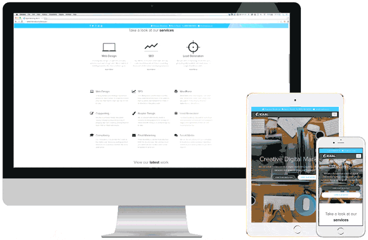
#2 Use responsive web design frameworks for your website
#3 Pay close attention to your website’s typography
#4 Double check on your website’s input triggers
#5 Improve the navigation of your website for all devices
#6 Use media queries for your responsive web design in 2020
#7 Track your web traffic and make improvements

What is Responsive Web Design (RWD)?
RWD is the practice of creating a website by taking into account the device compatibility, orientation, screen size etc. When a website is designed with responsiveness in mind, you will be able to multiply the traffic flow to the website thanks to the immense convenience it provides to users of all devices to access, view and perform CTAs (Call-To-Actions) on your website.
Tips for Responsive Web Design in 2020
#1- Plan your responsive web design
To maximize the responsiveness of the website that you’re creating in 2020, it’s important to draw out an effective wireframe of the functionality and the infrastructure of the website’s design for both desktop and mobile. You can test out a few ideas by creating prototypes and find the best option. There are quite a few tools available for testing RWD to make it as user friendly as possible: Responsinator and Responsive Test Tool.
#2- Use responsive web design frameworks for your website

(As seen from left to right) Bootstrap, Montage Studio and WordPress are a few frameworks that can save you time in creating the perfect responsive web design in 2020.
If your planned web design is pretty simple and basic and you want to make it responsive, a time saving solution would be to add an HTML Framework or work with a responsive WordPress theme or a Bootstrap theme. There are many other responsive web design frameworks that you can use as well. CloudCone has put together a set of guidelines for web designers on how you can boost the speed of your WordPress website in 2020. These options will be great for you if you don’t have an advanced coding knowledge, but would like to independently create your own website.
#3- Pay close attention to your website’s typography
An important step towards responsive web design in 2020 is fluid typography. While developing a website using CSS, setting the font size using pixels is widely accepted. However, this can go wrong when it comes to different screen widths. We here at CloudCone suggest using rem units for font sizing instead. rem units (root em units) are based on the font size value of the root html element. So make sure to specify a font size in the html element that is in your html document as well. You can use this guide to find out how to use rem units correctly.
#4- Double check on your website’s input triggers
Input triggers are places on your website that require your input when clicked. Examples of input triggers are sign up forms, surveys, picture upload spaces etc. They are important when it comes to fulfilling crucial website functions such as lead conversion. It’s crucial to optimize the accuracy of such input triggers for better responsiveness. To make sure that the correct input fields are used in forms (Example: Text keyboards to input in text fields and numerical keyboards to input in numerical fields etc.), you have to add the <input> tag when developing the form fields. Here’s a set of guidelines on how to do this.
#5- Improve the navigation of your website for all devices

In mobile view, badly planned navigation options can frustrate a user and convince them to bounce off your website. What most web designers resort to in this case is to have the items of your main menu behind a hamburger icon. This may reduce the clutter on your mobile design, but the icon can go unnoticed by some users. Confused users may then bounce off your website. You can try making the icon appear bigger or have the most important menu items outside the icon. You can later test out if this works as well. CloudCone has put together a tips and tricks list on how to test your web design in 2020.
#6- Use media queries for your responsive web design in 2020
A media query is a CSS technique that allows you to optimize the design and view of your website to suit different screen widths by taking into consideration the resolution and orientation of the screen. Media queries are quite important in responsive web design in 2020 as they are recognized as a W3C standard. Here’s a set of guidelines on how to use media queries on different aspects of your website.
#7- Track your web traffic and make improvements
 The last step to a complete responsive web design in 2020 is to understand why your visitors access your website on different devices. Mobile viewing can be a result of on-the-go website visits to get quick information such as contact details etc. The best ways to find out for sure are surveys and analytics. There are a lot of tools that allow you to get personalized analytics to your website alone. You can also use Google analytics which provides this option for free. Search for where your mobile traffic was headed and optimize the responsiveness of these pages for the respective devices that most of your visitors have used.
More to help you with you responsive web design in 2020….
Focusing on responsive web design in 2020 may seem like an extra step. But we here at CloudCone assure you that if you follow these simple yet effective tips, more web traffic will come your way in 2020 and not bounce off. If you need more great tips and tricks to make sure your website is generating leads by the second, CloudCone has got your back. Check out our other amazing blog posts: Here’s how you can increase the conversion rate of your website and earn more! To speed up your site and optimize its accessibility for a wide range of locations you can use the CloudCone CDN. Check out this blog post to find out how. If you’ve created a great, fast, and responsive web design, now is the time to earn more from your website by getting adverts. Here’s how you can make advertisers flock to your website!
Good luck with your responsive web design in 2020! Reach out to us if you have any concerns, suggestions, or general feedback.


About The Author: Anu
Content Strategist at CloudCone LLC.
More posts by Anu