Landing pages are a lifesaver when it comes to conversion rate optimization. And since every website owner’s goal is to increase conversions it is important to know why landing pages are such a big deal and how best to create your landing page so as to make optimum use from it.
What is a landing page and why do they matter?

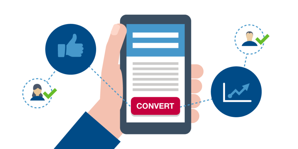
A landing page is a standalone page in your website that presents the visitor with a call-to-action. Typically landing pages come in 2 types;
Lead generation landing pages, used mainly in B2B websites, include web forms in them that are intended to collect lead data.
Click-through landing pages, on the other hand do not have any web forms but a simple call-to-action button.
Landing pages are so important because they are effective tools to help you drive traffic to your website and build your brand. Another one of their amazing benefits is that they make targeting easier. Lead generating landing pages have the advantage here since gathering information about the people interested in your offers is a direct path to quality targeting.
But some businesses avoid using them due to the misconception that they are difficult to build.
How to build a great landing page?

Keep the design clean and organized.
Obviously the look of a web page is bound to have a lasting impact on the visitor. A landing page that doesn’t confuse the visitors is an effective one. Make sure to incorporate green and/or red colored call-to-action buttons and to give the background a color that contrasts well with the buttons.
Have a minimalist approach.
too much information on a landing page takes away the whole point of having a landing page. Organize your key information that you believe, belongs mostly in a landing page. It is recommended that if you feel you have too much text to be put on the landing page, it is better to use a video to bring out the details.
Use the headlines and subheadings to convey offer value.
If there must be text in your landing page, it should be the heading and subheading that brings out what your offer is and why that is an amazing offer. Make sure to deliver a concise but clear message.
Keep the web forms short.
As I mentioned before, using a form in your landing page is key to targeting. But you don’t want this feature that you placed for your advantage, be the same that scares potential leads away. Make sure that your forms aren’t intimidating. The best way to do so is to keep the forms short. You could use another page (a thank you page for instance) to get the other details you need.
Make the landing page mobile friendly
This is key. 30% of all web activity comes from mobile phones. And studies prove that on certain occasions, having a mobile friendly site could double your conversions. It only makes sense that in this time and age, you must focus on making all your web platforms, mobile friendly.
Use trust signals
Trust signals are testifiers that guarantee the quality and trustworthiness of your brand to your visitors. You could use testimonials from key individuals, key organizations or your clients as one method of expressing the quality of your brand. Another method is using trust badges. Your trust badges could either be endorsements from top brands you’ve worked with, awards of recognition, or unofficial badges that signal and certify specific qualities offered by your brand (100% security, for instance).
Testing
At the end of each attempt at making a landing page, test it. It is the best way to improve. No matter how many blogs and web articles you read, the most relevant ideas of how to improve comes from testing out your own landing page. A/B testing is one of the popular testing techniques where you simultaneously test out two versions of your landing page to evaluate which version attracts more leads.
There you go. I hope that these tips will help you in building an awesome landing page for your website. Good luck and reach out to us if you have any concerns, suggestions or general feedback.


About The Author: Anu
Content Strategist at CloudCone LLC.
More posts by Anu