 Ever visited a website that was so unpleasant and confusing that you made it a point not to visit it again? This is a common experience for regular web browsers nowadays. Be it a formal purpose or an informal one, there’s nothing we dislike more than having to achieve this purpose through an obnoxious website.
If you are wondering how you could give your website the right interface which will enable you to attract more leads, continue reading.
First impression matters.
First things first, make sure that the viewers of your website get an excellent first impression. If their initial experience visiting the website is confusing and unpleasant it’s unlikely that they will return or even stay for long. Dissatisfied viewers could also create a negative grapevine effect by telling other potential customers how bad your website was. Communicate clearly and directly what goods and services you provide. Maintain clear communication through the website.
Know your target market and use appropriate language to communicate. If you observe websites closely you will notice how the style of writing isn’t the same in a fashion based website and a business based website. Make sure the writing is interesting as well as understandable to your target viewers.
Allow your website to be viewed properly on any device. Sometimes you may come across websites that are too large for your smartphone screen or too small for your laptop screen. Make sure that your website loads all content perfectly well within the frames of any device which would be used to view it.
Place calls to action carefully. Ever been to a website which asks you to fill out a form but you have no idea why that is necessary? This is a badly placed call to action. It does not only confuse the user but will also annoy them. Know when and where your viewers will want to complete a certain task within your website. Make sure your calls to action do not pop up at the wrong place.

Manipulate UX (User Experience Design) and UI (User Interface Design) appropriately. The Interface is what the viewers see and the Experience is what they have to do and it’s convenience level. These two concepts collectively address the graphics and navigation technique you use in your website.
Pay attention to UI detail.
When considering interface, the colors you use in your website, the symmetry, how you handle white space and the consistency are crucial factors. When you select a dominant color for your website always keep in mind that each color has a psychological effect upon the viewer. For instance, red stimulates the brain and gets energy flowing and blue delivers a sense of calmness, trust and formality. Therefore it is important to figure out what your viewers should feel and apply the corresponding colors.
The symmetry of the website is also important to maintain the perfect balance and determine which content gets certain percentages of attention from the viewer. There is a range of symmetrical categories to choose from including horizontal symmetry, approximate symmetry, radial symmetry and asymmetry.
How you handle white space is important because the amount of white space around certain content in the website determines the degree of attention this content gets. A picture of a burger in the middle of a white page gets a great deal of attention as opposed to the picture of a burger in the middle of a colored and busy background. It also ensures the level of readability your written content has. Paragraphs cluttered and crammed together are a viewer’s worst nightmare, given that these paragraphs contain important information that compels the viewer to read them. It is also common perception that white space or the color white in general adds an air of class and sophistication to the interface.
Be considerate of UX.

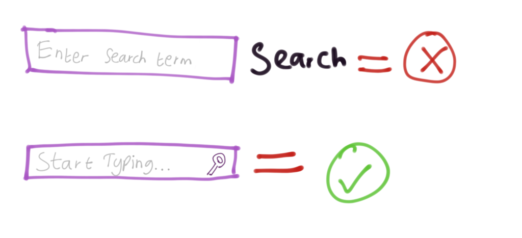
When considering User Experience Design, signifiers play a crucial role in websites. A signifier is technically a symbol that signifies a certain function like the magnifying glass signifying the search function. However this could also be grey text that can’t be clicked, hyperlinks, or sideways triangles. Using the right signifiers will easily navigate the user and make the outlook look convenient.
When you use all these factors in the right way when designing your interface, more and more viewers will be interested in your website, which automatically draws them towards your services so make sure your service quality matches up to the quality of your website.
So, have fun designing your web interface with the help of the tips we have provided. Feel free to reach out to us if you have any suggestions, questions or general feedback!


About The Author: Anu
Content Strategist at CloudCone LLC.
More posts by Anu